Candlestick charting is a popular method used by traders to analyze and visualize price movements in financial markets. This technique originated in Japan and has been used for centuries in trading rice futures.

A candlestick chart is a type of financial chart used to represent the price movement of an asset over a specific period of time. The chart is composed of a series of candles, each of which represents the opening, closing, high, and low prices for a specific time period.
Here’s a breakdown of the different parts of a candlestick:
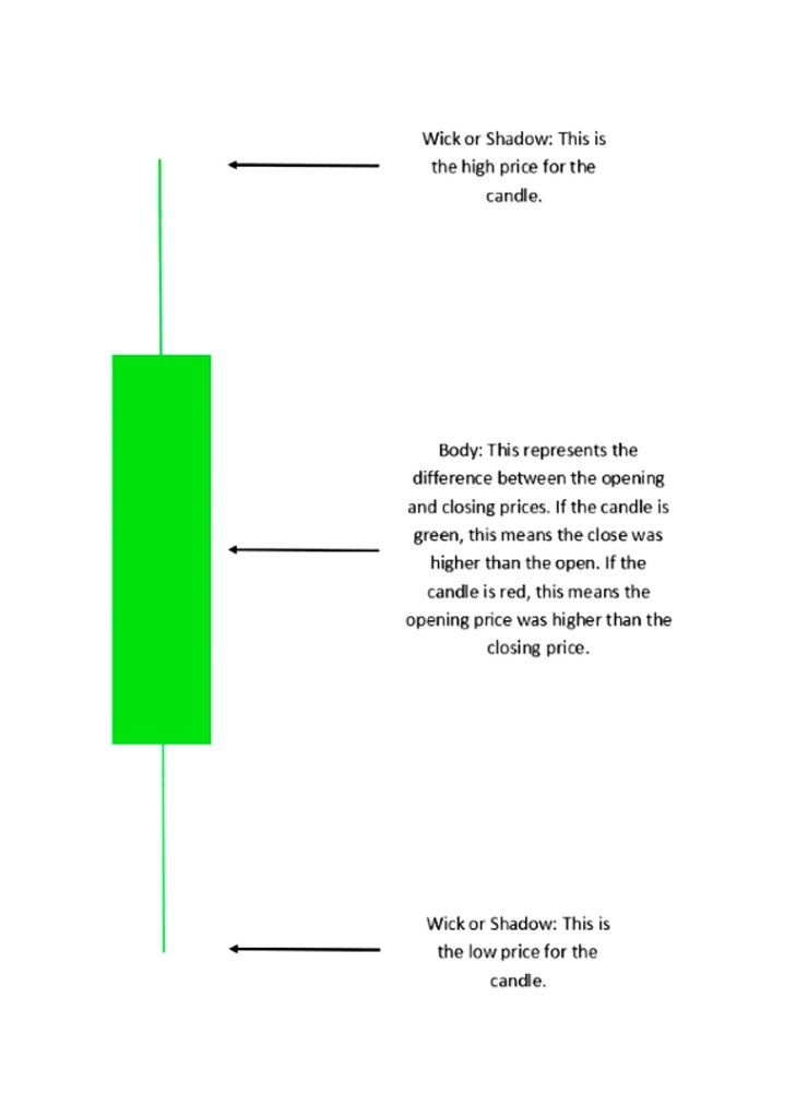
Body: The body of the candle represents the opening and closing prices of the asset during the time period. If the candle is green or white, it means that the closing price was higher than the opening price, indicating a bullish sentiment. If the candle is red or black, it means that the closing price was lower than the opening price, indicating a bearish sentiment.
Wick: The wick, also known as the shadow, represents the highest and lowest prices reached during the time period. If the upper wick is long, it means that the asset’s price went up significantly before settling back down. If the lower wick is long, it means that the asset’s price dropped significantly before settling back up.
Candlestick pattern:
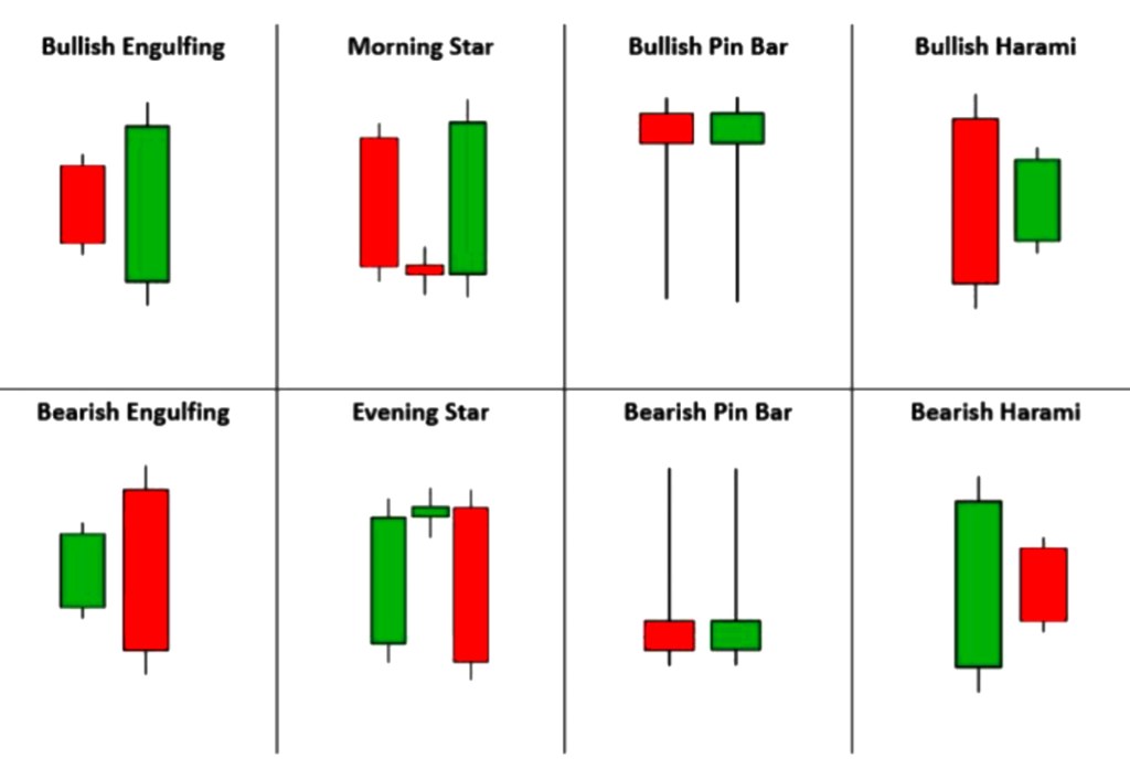
The overall shape and position of the candlesticks can reveal patterns that indicate trends and potential reversal points in the market. Some commonly used candlestick patterns include the hammer, the doji, the engulfing pattern, and the morning star.
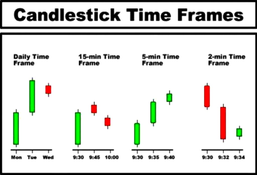
Candlestick charts can be used for various time frames, such as one minute, five minutes, one hour, one day, one week, or one month. Traders use these charts to identify trends and potential trading opportunities. Some popular technical indicators used in conjunction with candlestick charts include moving averages, Bollinger bands, and relative strength index (RSI).
Difference between candlestick charts and patterns
Candlestick charts and patterns are two different tools used in technical analysis to help traders and investors understand market trends and make decisions about buying or selling assets.
Candlestick charts are a type of financial chart used to represent the price movement of an asset over a certain period of time. They display the opening, closing, high, and low prices for each period as a series of rectangular bars, with the color of the bar indicating whether the asset price went up or down during that period. Candlestick charts allow traders to quickly and easily visualize the price movements of an asset, as well as identify patterns in the price action that may indicate future price movements.
Patterns, on the other hand, are specific formations or sequences of price movements on a candlestick chart that traders use to identify potential buying or selling opportunities. For example, a bullish pattern such as a “hammer” or “bullish engulfing” candlestick may indicate that an asset is likely to rise in price, while a bearish pattern such as a “shooting star” or “bearish engulfing” candlestick may indicate that an asset is likely to fall in price. There are many different patterns that traders use to make decisions about trading, and they are often based on the specific shapes and combinations of candlesticks that appear on a chart.
In summary, candlestick charts are a type of financial chart used to display price movements, while patterns are specific formations or sequences of candlesticks used to identify potential buying or selling opportunities. Traders use both candlestick charts and patterns to gain insights into market trends and make informed trading decisions.

Leave a comment